The fictional brief: help a small renovation company present the same care online that it brings to a home. Westward needed a recognizable identity, clear service descriptions, and an approachable way for homeowners to start a project.
02 / THE APPROACH
Find the brand’s point of view.
A sturdy wordmark anchors a palette of stone, charcoal, and muted blue. We paired practical workwear and simple stationery with a website that explains the services, the process, and the next step in plain language.
THE IDENTITY
One brand. Room to play.
EXPLORE THE LOGO DIRECTIONS ↓
PRIMARY SIGNATURE
WESTWARDBUILD & RENOVATE
SOURSTUDIOS / BRAND EXPLORATION
Explore three logo directions and color combinations. Each has a different role in the identity.
COLOR WITH CHARACTER
Stone#ECE4D7
Charcoal#2A3138
Blueprint#AFC4D1
THE TYPE SYSTEM
Aa Bb Cc.
Barlow Condensed / DM Sans
BEYOND THE LOGO
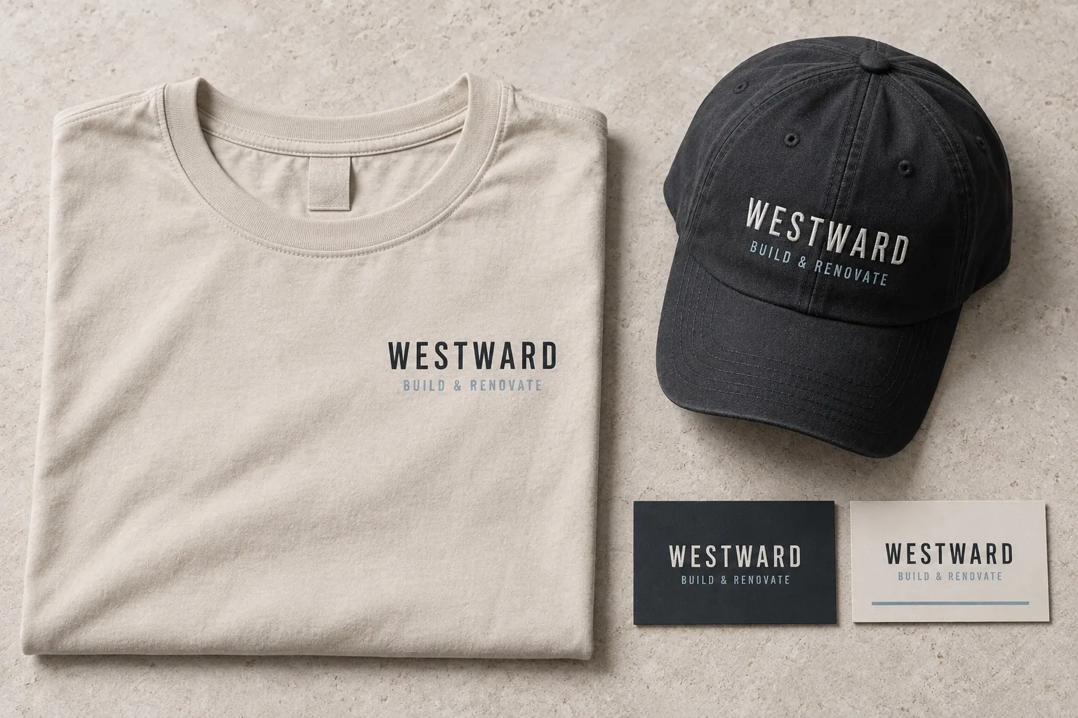
Workwear & print
An identity made for the everyday work. Explore the shirt, embroidered cap, and business cards to see how it carries across materials.
THE DIGITAL EXPERIENCE
A home for the whole story.
Clear content, a distinctive visual language, and a considered mobile experience. See how the identity becomes a website.
One identity across the work shirt, cap, business cards, and website. The design makes a small team feel organized and helps homeowners understand the kind of projects it takes on.
This is an illustrative case study for a fictional company. The mockups demonstrate a design direction, not a commissioned engagement or measured business results.