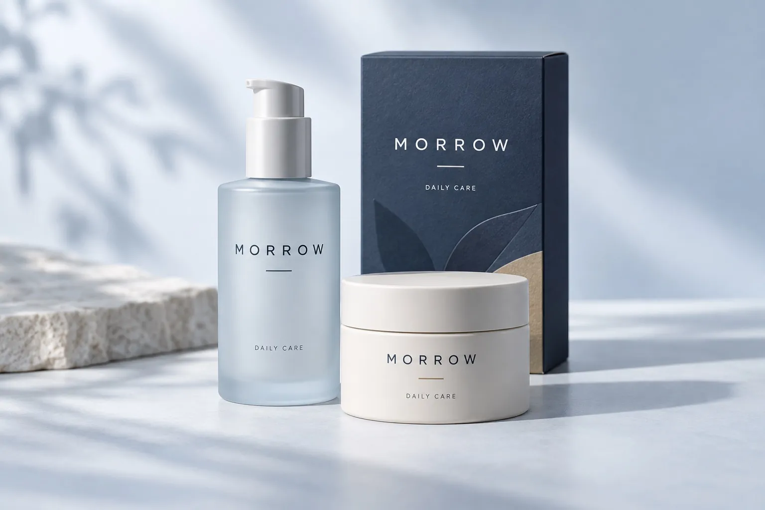
The fictional brief: give an independent personal-care brand a clear identity in a crowded category. Morrow needed to feel thoughtful and approachable, with packaging that makes each product easy to recognize and a website that keeps the daily routine simple.
02 / THE APPROACH
Find the brand’s point of view.
We built the identity around a restrained wordmark, mist blue, deep navy, and a touch of sand. Clear product names, generous space, and tactile photography carry the same quiet confidence from a small jar to a full product page.
THE IDENTITY
One brand. Room to play.
EXPLORE THE LOGO DIRECTIONS ↓
PRIMARY SIGNATURE
MORROWDAILY CARE
SOURSTUDIOS / BRAND EXPLORATION
Explore three logo directions and color combinations. Each has a different role in the identity.
COLOR WITH CHARACTER
Mist#DDE7ED
Midnight#223247
Sand#D7C4AB
THE TYPE SYSTEM
Aa Bb Cc.
DM Sans / Regular & Medium
BEYOND THE LOGO
Everyday essentials
A coherent family of bottles, jars, and cartons. Explore the campaign and packaging detail to see the identity at different scales.
THE DIGITAL EXPERIENCE
A home for the whole story.
Clear content, a distinctive visual language, and a considered mobile experience. See how the identity becomes a website.
A connected identity for packaging, campaign images, and a digital storefront. The system gives each product a clear place in the range and makes the everyday routine easy to understand.
This is an illustrative case study for a fictional company. The mockups demonstrate a design direction, not a commissioned engagement or measured business results.